
This gives an average of 58.25 for Labor and 41.75 per cent for the Coalition. Plug these numbers into the election calculator and see what you get.
A pie chart of the "see what you get" with a uniform national 11% swing (normal caveats etc):

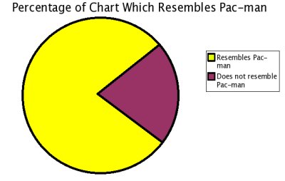
The red area of the pie chart is almost large enough to resemble pacman.
Not quite five minutes to midnight - but you can definitely hear that graph ticking.
Crikey almost makes up for giving David Flint an outlet by republishing CCrosby/Textor Doomsday analysis, courtesy of Possum C (on his/her site a few days back).
No laughing, this is serious.
Looks like it has been taken down amanda.
Oooh. Ha. Shut. Door. Horse. etc etc
Anyway, Ken has linked to the original piece.
Don't know why, guess it was the graphs, but that shouldn't disqualify the text around the graphs.
If pacman was a thylacine.